Since its inception as a group of 13 likeminded architects who first assembled in 1857 at the New York office of Gothic Revival champion Richard Upjohn, the American Institute of Architects (AIA) has evolved into global network encompassing more than 94,000 members and 300 chapters around the world. Following AIA’s core belief in architecture’s unique ability to drive positive change, AIA Austin was incorporated in 1957 and has grown into the third largest chapter in Texas. A tradition since 1987 — the year SXSW first reared its head — the AIA Austin Homes Tour has showcased 325 architecturally significant residences, with the neighborhood of Tarrytown and local firm Dick Clark + Associates taking top honors in terms of representation over the years.
Set for October 19 and 20, the 33rd annual AIA Austin Homes Tour unites 12 homes across the city — four of which feature specialty hardware and fixtures from Alexander Marchant. Designated as this year’s VIP Home, 3402 Foothill Terrace will play host to an exclusive happy hour on Saturday evening. (Advance tickets can be purchased here.) In anticipation of the tour, we spoke to architect Jim LaRue, a Victoria native and Texas A&M graduate who moved to Austin in 1980 and founded his firm LaRue Architects in 1989. Over the last three decades, LaRue’s award-winning firm has completed hundreds of homes while fusing site-specific materials and modernist sensibilities in a regional aesthetic dubbed “Hill Country Contemporary.”
In addition to Foothill Terrace’s key features and hidden details highlighted in our Q&A, keep an eye out for Alexander Marchant-sourced cabinet hardware from lines including Armac Martin and Turnstyle.
If you had to define “Hill Country Contemporary” to someone who’s not in the world of architecture or design, how would you describe the overall approach and look?

Well, it’s not really an actual, formal [term you could] look up in an architecture magazine. But the Hill Country reference part is that the materials are regional. So we’re trying to use materials to build the buildings that are “of their place” when we can. And then that the homes are suited for their environment: the roof is appropriate, the overhangs are appropriate, the solar orientation is right. So the buildings are of their place with the materials that are of their place. And then the contemporary part speaks to the architecture. So the Hill Country part places it, and the contemporary part is the architecture side of it. And then, for us, more specifically, it means floor-to-ceiling glass, broad overhangs, well-sited buildings and long [structures that are] more horizontal in nature than vertical and steep.
Can you give me specific examples where the site informed the materials that you used?
Almost every project we do, but we do a lot of ranch-type projects. In those, the site definitely informs the materials selection. If you’re in an urban neighborhood, the houses around you may inform the materials selection. So everything is being influenced by what’s going on around it. Sometimes it’s client preference and it is what it is. But generally, we try to dictate those materials that are compatible with the architecture.
What sort of influence did the Foothill Terrace site have on the house you built there?
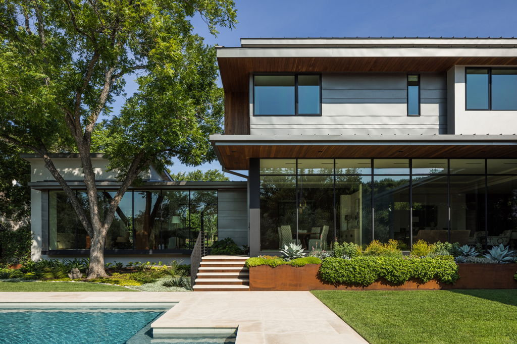
It’s urban — well, it’s suburban/urban — but it’s central Austin and so there are existing homes all in place. A lot of siting that home is being informed by what’s happening on each side of it and behind it. It’s not the greatest lot that one could ever find, but it had some nice features. It was reasonably flat [with] a couple of nice trees. So that sort of dictated exactly how that building would sit on the site.
What about the materials?
In that neighborhood the homes are stone, brick, wood siding. We didn’t use brick, but we did use stone. And then we used wood siding — but in a more contemporary approach. We just referenced those materials that are on the other buildings around it. And then we used a metal roof, which is maybe not so much of that neighborhood, but it’s what we used.
What are your favorite aspects of the finished project?
It really enhances its site and I love how it’s really sort of private to the street. It’s understated and it wraps its beautiful gardens in the back — that’s where it created an internal focus for this house. It’s very private but it’s really nicely sited.

What can you tell us about the pool?
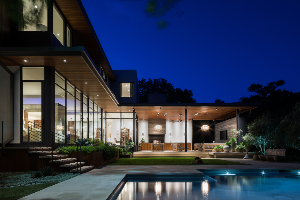
The pool is designed to align with the architecture. So if you’re standing in the foyer, the edge of the pool lines up on the edge of the foyer glass in one dimension. And then in the opposite direction, the shape of the pool is aligned with the outdoor living space.
So it sort of mimics the exterior?
It responds to the exterior. You can see the building reflected in the pool, and overhead the offset shape of the pool follows the offset shape of the roof that’s right beside where you access the pool. So it’s sort of a mirror reflection — which the pool often is.
Are there any hidden gems folks might want to look for when they visit the Foothill Terrace project on the Homes Tour?
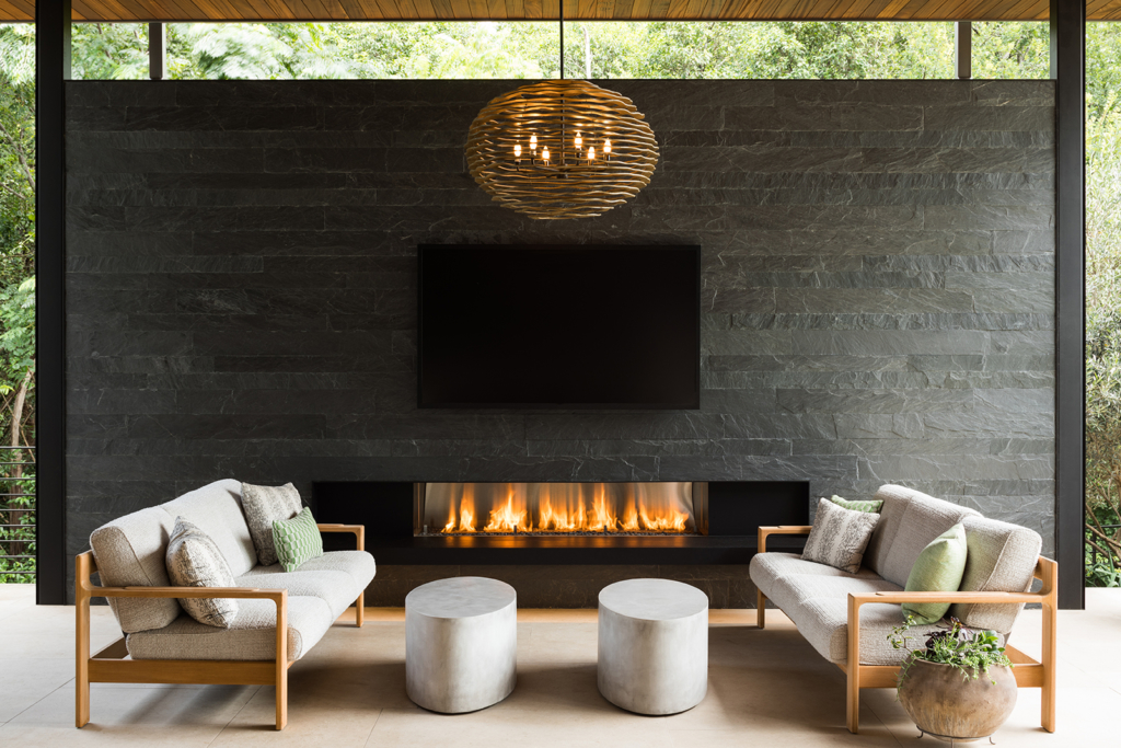
This particular house is a lot about the detailing. If they look closely at the details, there are some unexpected materials inside of this house that are maybe a little edgier than one might expect when you actually visit it. There are a couple of doorway openings that lead from one space to another and they’re cased in plate steel. And there’s a beautiful, full-height sliding door that closes off the library. There are partitions that separate rooms but they don’t touch the glass — the glass is continuous but the rooms are still separated. So there’s a lot going on. That’s what they need to look for. Look for the little details [like] cantilevered fireplace hearths. The screened porch has roll-down screens so that clients can enjoy it all year-round — especially in the evening. You know how buggy it gets in central Austin. And the way that those tracks were set into the ceiling, if you’re not looking for them, you could not even know they exist. There’s a lot of detailing — a lot of subtle little pieces, little cantilevered slabs on the outside. When you’re walking around, you’ll see that the building hovers over the landscaping and the landscaping comes up and then under and engages the building. So there’s a lot to see. You have to slow down and take a look at it.

